Wednesday, April 24, 2013

KanKin For All


Designed by Alexey Frolov, otherwise known as MRfrukta, KanKin is a classic looking font with modern flairs which allows this font to be used in both modern, and traditional looking projects a designer may work on.


One of the best things about this font is that it is free for download on teh interwebs! I hope that I can come up with some interesting designs of my own with this useful font.


Tuesday, April 16, 2013

GoT Font Talk

While watching the latest episode of Game of Thrones, I noticed the typeface and thought it was pretty amazing. 


It was this image that probably caught my eye as I was watching the show last night. Great episode by the way! The ending of the third episode had endings for three different characters. 


The font used for the Game of Thrones show is Trajan Pro and it's a really interesting font that uses really sharp and precise serifs. The vertical lines in the letter 'O' were added when used for the show and adds another element, like the elongated 'T' in the word Thrones.

Trajan Pro


Wednesday, April 3, 2013

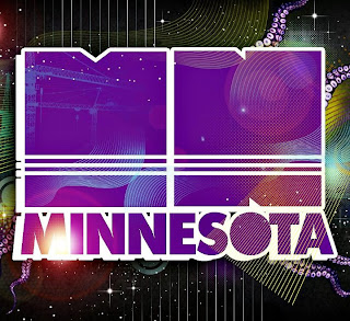
Minnesota


I was very lucky last Thursday night to get to work the Minnesota show that came to Urbana, Illinois. It was the very first act that has played The Canopy Club that was familiar to me. I have used some of Minnesota's tracks in my very own mixes, so I was very happy last Thursday.

A Minnesota track on YouTube


The font that is used is a very simple sans serif font that works very well with a drop shadow behind it. I really like how the circle in the center of the 'O' is missing, making the letter seem more solid and heavy to me. I also think of the moon when I look at the 'O' in the Minnesota typeface.