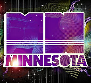
A Minnesota track on YouTube
The font that is used is a very simple sans serif font that works very well with a drop shadow behind it. I really like how the circle in the center of the 'O' is missing, making the letter seem more solid and heavy to me. I also think of the moon when I look at the 'O' in the Minnesota typeface.


No comments:
Post a Comment