Monday, September 30, 2013

Art Nouveau Adam Hughes


This man here is probably my favorite artist of all time. His name is Adam Hughes and he draws mostly for the comic book medium. Mr. Hughes is most noted for his drawings of women and his ability to make his images photo-realistic. Adam is also a licensed illustrator for Lucas Arts and that's why he's able to draw characters from the Star Wars and Indiana Jones universe and not get slapped with a lawsuit. 

During my studies for my graphic design history class I ran across work from a French artist named Alphonse Mucha. I was really surprised at how similar Hughes' work was to Muchas'. So now I'm a big fan of Alphonse Mucha as well as Adam Hughes, and I'm sure Hughes is also a big fan of Mucha. I hope Hughes had to study Mucha when he was in college, much like I have to study his work now.


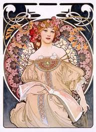
This is a piece from Alphonse Mucha. His illustration skill is apparent, he's a master. 


The image to the right is also work from Mucha. The borders he puts around his subjects are very detailed, and the flowing lines in the entire piece is French art nouveau at its finest.


Hughes uses a lot of the techniques that were first created during the art nouveau movement (c. 1890 - 1910), and he refines them to the pinnacle of the style. The surrounding images show an homage to Mucha, and a technique first pioneered by Henri de Toulouse-Lautrec.


I wonder now, if I hadn't known of Adam Hughes, would I have not noticed the work of Alphonse Mucha? Also, vice versa, would I have appreciated Mucha's work if I hadn't already respected and admired Adam Hughes' art? Either way, I'm glad I have discovered both in my lifetime and hope to use their work as inspiration for my own illustration.


Some more of Adam Hughes stuff. I could post pictures of his work all day, but instead, I will give you a link to his website. I hope that one day I will be able to afford a commission by Hughes.


Finally, I leave you with Mucha's poster for Job cigarette papers, 1898. Simply amazing.


FIN

Saturday, September 21, 2013

Field Trip: Rare Book Library University of Illinois


Last Friday my Graphic Design History class went on another field trip. We went to the Rare Book Library in the main library at the University of Illinois. I thought the trip was going to very dull and boring, but I was actually interested. One of the curators, a Mr. Marten Stromberg delivered an amazing presentation of some works collected there and kept the trip very entertaining. The above picture is from Gutenberg's Bible, probably one of the earliest prints of all time. It is an example from the year ca. 1450 and shows us a Gothic/German influence on the typeface brought to us by the man who brought printing to the western world.


The above image is a French children's pocket book. They type was so small that it was nearly impossible to read with my own eyes and the curves of the font didn't help either. The entire book could have fit in the palm of my hand. Tiny!


Starting to see a Roman influence in these early works, but the reason I took this picture is because of the beautiful drop cap and gorgeous borders that were printed from wood engravings. I have to admit that I'm not that interested in the printing side of graphic design, I have a concentration in the illustration side of my major, so I'm much more impressed by images and pictures. Early print still piques my interest somewhat, but those borders really catch my eye, especially that top border, it almost pops off the page for me.

Another example of early woodgraving. I apologize for not knowing the name of this work, or others in this blog. I was given a sheet that has all the names of the pieces we saw on the field trip, but I can't read Latin and even the English titles don't ring any bells when I read them. This piece is different because it sort of mixes a German style with a Roman influence.


This piece on the right is an example of some the best looking borders I've ever seen in early works. It's hard to believe that it was a wood engraving that was pressed onto paper to make the border. I couldn't imagine creating the engraving used to create these images. I think it would take me years to make just one of them and shudder at the thought of spending that much time.


An example from 1786 from William Caslon, the designer of the font that was used in the Declaration of Independence. Stromberg told us a funny story about how Benjamin Franklin took this work and ripped the top off, to conceal that it belonged to Caslon, and then took the type around to his friends, proclaiming this was an example of Baskerville's work. Baskerville was a contemporary of Caslon. Franklin asked his friends what the faults in the type were, then took his findings back to Caslon and informed him what he had learned.


Finally, a sans serif typeface! From 1945, by Kenneth Patchen, an architect. Designers of this period were tired of serifs and hailed futurism, their work showing great strides in font design. I can't believe how great this page looks and that it was created around the end of World War II. I have seen works created today that look very similar to this, because we are still using these fonts. Simply beautiful! It's hard to believe this was not printed digitally. Stunning! This is the kind of type I can really get behind.

Saturday, September 14, 2013

Sign Painters

My graphic design history instructor suggested we watch a film that was recently playing at the art theater in town here. The movie was 'Sign Painters', and after watching the trailer for it on YouTube, I wish I had seen it. 


How can you not want to make some sort of sign after watching that? If I had some wood and the paint I would like to make a little sign that I could hang on the outside of my door. 


The trailer mentioned how the advent of vinyl graphics and letters made sign painting a lost art form and then showed a few decrepit signs on random buildings. I can't recall the last time I've seen a sign in bad condition, but I can say I would like to see more hand painted signs wherever I go. The recent trip to The Living Letter Press in Champaign made me appreciate an older way of printing, and the trailer for Sign Painters makes me feel the same for signage. 


This sign really sticks out, with the contrasting colors between black, red, and blue. 


I wanted to show a few of the signs my friend has made for this little eatery he worked for, but it took too long to search for them on his facebook, so here's a sign with a dog on it.

Monday, September 9, 2013

Brave New Fonts

I've been reading so much about the history of writing, printing, and design that I just need to get away from all of that for a wee bit and look at some cool, new, fresh, and interesting fonts for a while. Come with me for a short time and enjoy a few of these "out of the box" typefaces.


You might think that a really new and cool looking font would at least get some sort of label or name to it, right? Unfortunately that's wrong. I found this at typepad.com, but was unable to find the name of the font, or the designer's name. I'm afraid that today's designers sometimes get little press and notoriety. My hat's off to the anonymous designer who made this awesome letter set. Due to the colors in the set, I would probably only use something like this as a headliner.


The Bifur font, designed by Adolphe Mouron Cassandre, a Ukrainian-French painter. This is another excellent new design that could give any project an Art Deco feel and would be perfect as a headliner, or display type font, like the typeface above this one.


What's going on with this font? Is it 2D or 3D? Cubic, by Svetoslav Simov is available on myfonts.com in a set of three different weights, thin (pictured here), light, and normal. The set costs $70. Don't you want to design and sell a font set now?


This font is very entertaining to look at and I find myself trying to name the different systems that these joysticks came from. Console font by Varun Vachhar. As I list the last designer in this blog post, I keep asking myself, "Why are all these cool fonts designed by foreigners?" It is a rhetorical question, of course, and I vow that this American boy will create a cool font himself one day. Why not? It's something to do.

Monday, September 2, 2013

Another Year Another Graphic Design Blog

I decided to recycle my old Typography blog into my new Graphic Design History blog. A simple switcheroo on the name and taa-daaa!


I hope to learn a lot in my Graphic Design History class. This is the only class I have that is in the program I want to be in, but I am taking two classes in the Digital Media program, and those classes have truly piqued my interest in animation and 3D design and modeling.


I'm going to stay the course however and stay in the Graphic Design program. Maybe I can get a certificate in Digital Media? You never know, ya know?


I have been posting some images I have found on the i: drive that contain graphic design images that captured my interest.


Here's to a new year of school and to learning a lot of stuff I didn't know and applying that to my passion of drawing and illustration!